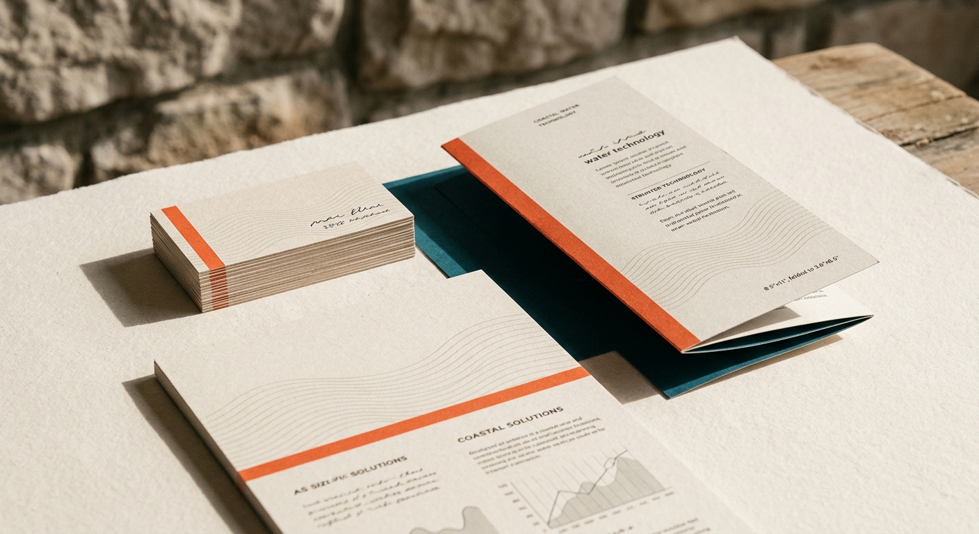
Tideline had the engineering to pull drinking water out of the sea. What it did not have was a brand anyone would trust with their coastline.
The problem
Clean tech that read as cold tech
The category is full of blue gradients and stock water droplets. Tideline looked exactly like the competitors it was trying to out-engineer, which made investors nervous and made towns even more so. Water is personal. A brand that sells it has to feel accountable, not futuristic.
We threw out the gradient. The new system is built on a clean white ground, a single electric-blue accent for the moments that matter, and a mark that reads as both a shoreline and a level gauge depending on how long you look.
What we made
A full identity: the mark and its motion behavior, a two-typeface system, a plant-signage kit that survives salt air, an investor narrative, and a website that explains desalination without a single stock photo of a droplet.
The mark had to survive being bolted to a pump the size of a bus and printed the size of a stamp. It does both, and it still looks like water.
The outcome
A brand the towns could argue for
The rebrand carried Tideline through a funding round and into its first two municipal contracts. More useful to us: the internal team started making on-brand work without asking, which is the only real test of whether a system works.
The point of view did the qualifying. The companies that liked the honesty stayed; the ones that wanted another blue gradient went elsewhere, which was the plan.
Next
More from the studio

Let's build something
Got a brand that deserves a second look? Tell us what you are building.