ORBIT TEA®
Orbit came to us with a clear ask: double shelf presence in one season without doubling the range. They were not after a trend or a mascot, they wanted a system that the packing team, the printer and the shop buyer would all read the same way.
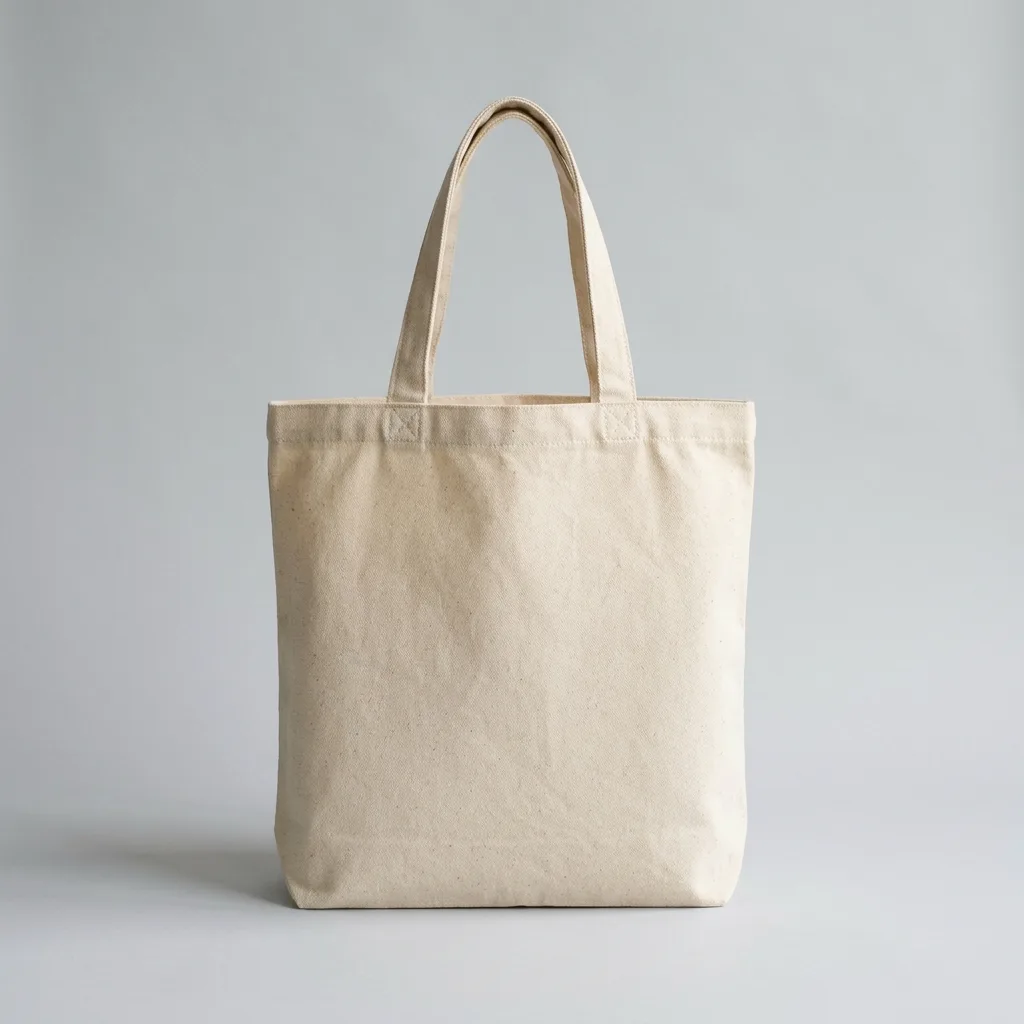
A house tea brand that had outgrown its shelf
Orbit had eleven blends, four label templates and no way to tell them apart at arm's length. We started by throwing away the tin that everybody in the building loved, then rebuilt the range around one grid, one type family and a colour per origin.

Colour that survives a supermarket shelf
Every blend got a wash drawn from the brewed liquor itself, photographed in the studio rather than picked from a swatch book, so the shelf reads as one family from six metres away and as eleven distinct products from one.
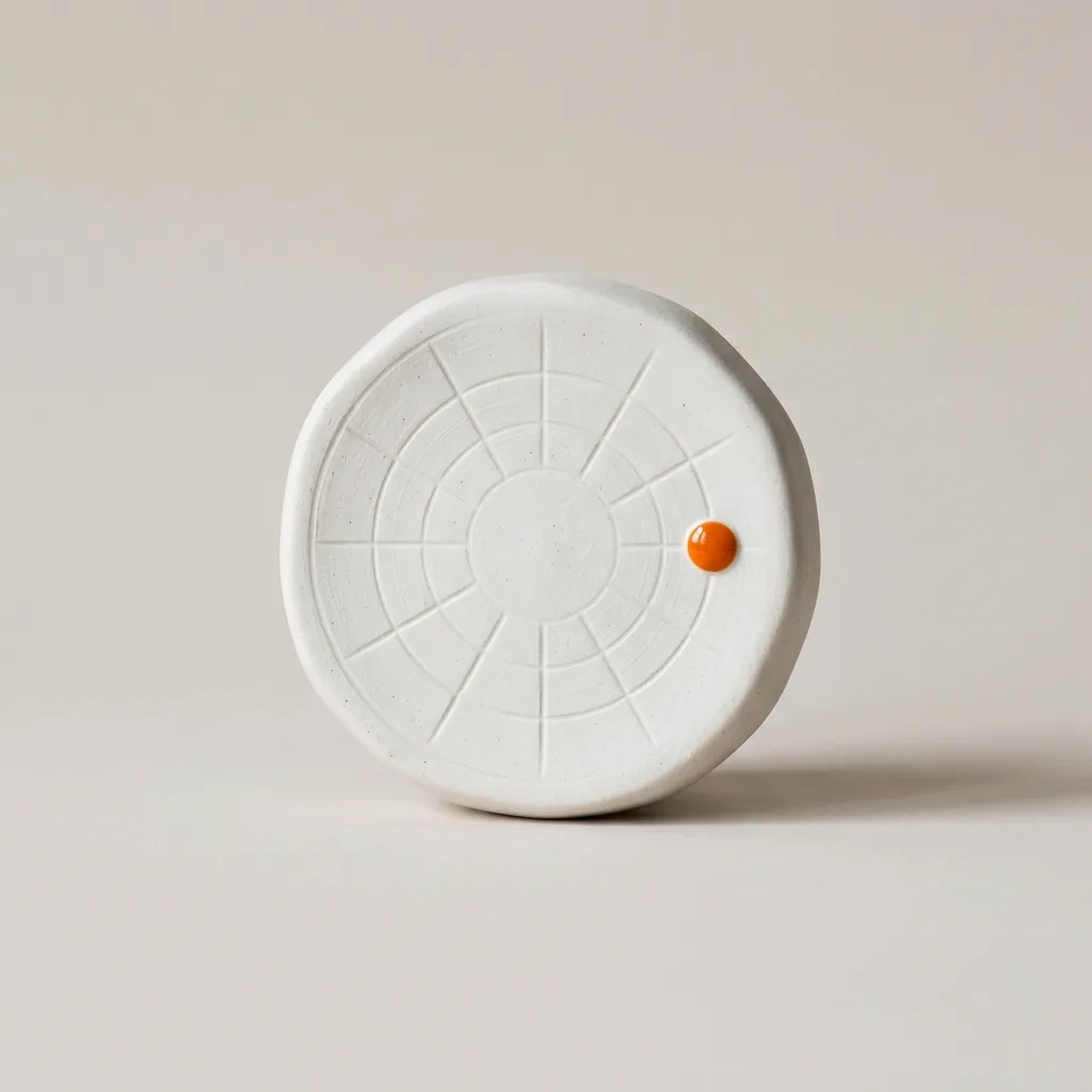
A system the packing team can actually run
The artwork is a single template with locked zones. Their operations team fills three fields and exports print ready files without calling us, which is the part of the project that still saves money two years later.

Launch, then hand over the keys
We ran the first month of the campaign with them, then handed over working files, a twenty page rule book and two training sessions. No retainer was required for them to keep using their own brand.
More work.
( _©26 )

Working on something?
Send the messy version. We read every note ourselves and answer inside one working day.
Start a project